SEO Meta Description: Cluttered logos are not even in the competition. In 2026, minimalism isn’t a style; it’s survival. You can read this article and know about it.
A Guide to Minimalist Logos in 2026: Simple, Clean, and Modern
More brands are leaning toward minimal logos in 2026, mainly because they work better on the devices people use every day. A mark has to stay clear on a watch face, a phone screen, or a small profile icon, and complex artwork doesn’t survive that scale.
An AI logo creator often suggests simple forms because they remain easy to read across different formats. The move toward minimal design comes from practical needs, whether the logo appears on a package, a homepage, or a small app tile.
Why Logos Need to Work on Smaller Screens?
The biggest driver of this movement is purely technical. Twenty years ago, a logo had room to breathe. It lived on the side of a delivery truck or the top of a letterhead. You could get away with intricate details, hidden meanings, and complex gradients because the physical space allowed for it.
Today, your logo has to live on a smart watch. It has to live as a 16-pixel favicon in a browser tab that is barely visible. It has to look good on a massive 4K monitor and a tiny mobile notification banner simultaneously.

Complex logos fail this test every time. If you have a gradient, it looks cheap on low-quality screens; fine lines disappear completely when scaled down. If you rely on four different colors to distinguish the shape, it falls apart when a user has “Dark Mode” turned on.
This is where the new wave of design thinking comes in. Even in high-energy industries, you see a pivot. A few years ago, if you went looking for a gaming logo maker, you would find nothing but angry wolves and skulls with glowing red eyes.
Now, even esports teams and streamers are moving toward abstract, geometric symbols. They realized that a “cool” illustration looks like a smudge on a mobile stream overlay. A simple, bold shape stays crisp. It cuts through the clutter of the chat window.
Simple Logos Are Easier to Recognize
You scroll through thousands of images before finishing your morning coffee. When a customer scans your brand, they make a brutal, unconscious calculation: is this worth the mental energy to figure out?
A complex logo asks for work. It asks the brain to decipher multiple elements. “Okay, there is a tree, and a bird, and the sun, and the name is Green Valley…” That process takes milliseconds, but those milliseconds add up to friction. Online, people move quickly, so anything that takes extra effort to interpret often gets overlooked.
![]()
A minimalist logo asks for nothing. It just sits there and increases your confidence. Think about the most successful tech brands. They don’t ask you to read a tagline or to interpret a scene. They give you a shape, a fruit, a window, a bird, and you get it instantly. Reducing cognitive load screams “premium.” It implies you’re established enough to skip the explanation. Cluttered identities just feel desperate, like a nervous hard sell. In 2026, confidence looks like silence.
Why Minimal Designs Stay Relevant Longer?
For a long time, companies tried to look futuristic to signal that they were innovative. They used Chrome effects. They used blue glows. Remember those sci-fi spaceship fonts? They aged like milk. It looks like the future viewed from 1999.
Designers are choosing simpler shapes because styles labeled as “futuristic” tend to age quickly. Minimal forms stay relevant longer and require fewer updates. Minimalism works because it ignores the trends, because a circle is always a circle.
The companies that use minimalistic logos root their identity in basic geometry and insulate themselves from trends. They don’t have to rebrand every time the design fashion changes because they aren’t wearing the fashion. They are wearing the basics. This saves millions of dollars in rebranding costs down the road.
Universal Logos Helps You Expand Easily
These days, people are trading across borders more than ever before. A small e-commerce store in Ohio can sell to a customer in Tokyo. A streamer in Brazil has viewers in Germany.
Text is a barrier, and relying on a slogan traps you in one language. Symbols bypass translation. An arrow signals growth in every economy; a shield implies safety in every culture.

Simple symbols work well across different languages and regions because they rely on shape rather than text to be understood. Big players don’t drop text to be artsy; they do it to be understood by everyone, everywhere, without saying a word.
What Makes Minimal Design Harder Than It Looks
Detailed effects can make a logo appear busy, while simpler designs require careful decisions about proportion and spacing to look balanced. When you only have two lines and one color, there is nowhere to hide. Every proportion has to be perfect. The spacing has to be mathematically exact. Minimalism isn’t about doing less work. It is about doing more thinking. You have to distill the entire essence of a company down to a single mark.
How X-Design Supports Minimal Branding?
This is where the tools that you use start to matter. Most legacy design software is built to add complexity. You have endless filters, effects, and brushes. It encourages you to over-design.
X-Design is different. It has emerged as a platform that seems to understand the value of reduction. It doesn’t function like a traditional editor where you drag clip art onto a canvas. It works as a Creative AI Agent.

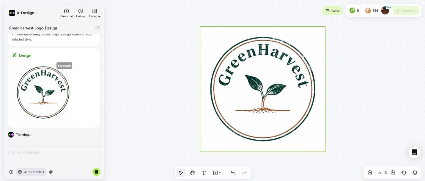
With X-Design, the process starts with describing the style you want, and the tool builds options based on those details rather than offering random illustrations. You are describing a concept. If you tell it you want a “minimalist brand for a coffee shop,” it doesn’t give you a detailed illustration of a bean. It understands the request for minimalism. It generates clean, vector-based concepts that rely on shape and negative space.
Keeping a Minimal Logo Consistent in X-Design
Minimalism leaves you nowhere to hide. With so few elements, precision becomes everything. Shift that shade of blue just a fraction, and the entire identity feels off.
X-Design solves this with its “Brand Memory” feature. Once you settle on that perfect, simple mark, the system locks it in. It remembers the exact hex codes. It remembers the specific font weight. When you go to create a mockup or a social media post, it enforces those rules. It prevents you from drifting away from your core identity.
X-Design Allows You To Test Your Minimal Logo on Real Products
Minimal logos may seem plain at first, but seeing them applied to real products or mockups often makes their clarity easier to appreciate. X-Design helps you trust the simplicity by showing you the context. Test the design on a tote bag or stitched hoodie. Nothing proves “less is more” faster than seeing it survive the real world.

You realize that the simple shape looks expensive when it is on a product. You stop trying to fill the white space. The tool effectively acts as a guardrail. It gives small business owners and creators access to the same “less is more” philosophy that expensive agencies use.

Final Verdict: What Minimalism Means for 2026 Branding
Minimal logos continue to work well because they stay clear, adapt easily, and remain consistent across different formats. A simple mark is often easier to maintain and gives brands a reliable foundation as they grow. A real logo keeps its soul whether it’s plastered on a billboard or shrinks down to a smartwatch. Strip away the gradients and shadows until you can’t remove anything else.
Reduction is power. A simple logo is easier to manage long-term. After you finalize your design in X-Design, the platform keeps your colors and shapes aligned across future materials. Simplicity wins because it respects time, the one resource nobody has enough of.


